Sidebar
Graphic Design
>I’ve taken every plate in the USA — one from all 50 states, plus the District of Columbia, the five US overseas territories, and special plates used by the Federal Government, and sorted them according to my preferences, ranking on originality of design, technical execution, and quality of the concept. I’ve also awarded bonus points for some which I think are particularly fun.
 dribbble.com
An article by Peter Cho > This month I launched my first typeface, hopefully the first of many. It’s called Peasy, and it’s a low-contrast humanist sans type family that works well for setting long-form text. Peasy was my thesis project from my type program, and to be honest, the name came first. > > The project started with a few original inspirations — one was making something “easy” — clean, easy-going, a font I would want to use myself. Another was the idea of modular, multi-color type. Here I explored ideas for stencil and multiple stroke inline styles. 

Hello, I was wondering if the color palette/style used in this poster has a name? Poster by [Junno Salvanera](https://www.behance.net/gallery/125020217/Poster-Collection-Vol-1)
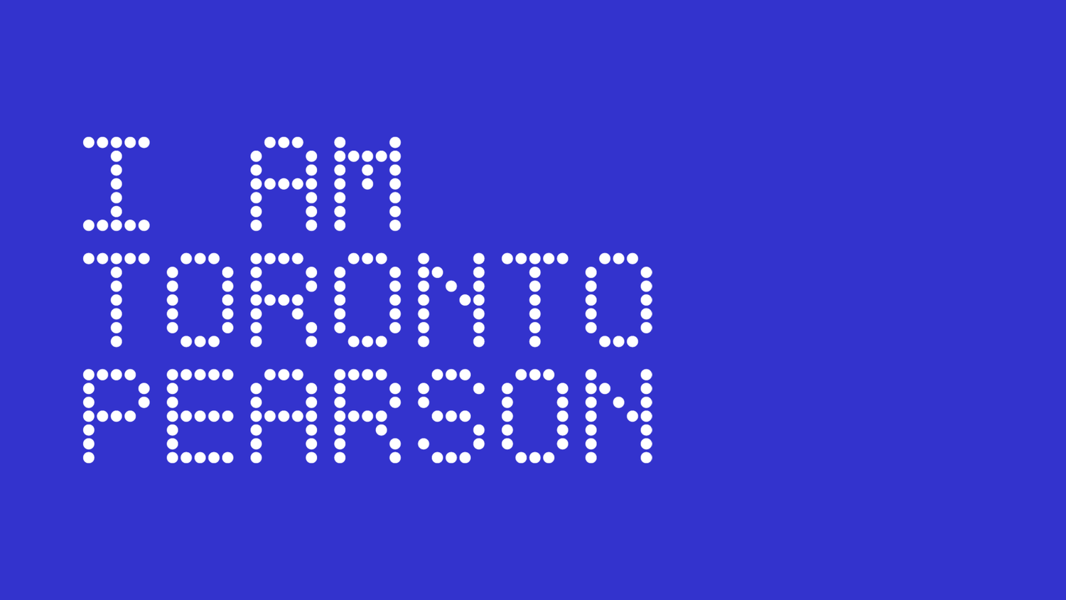 www.iamtorontopearson.com
Official announcement : https://www.iamtorontopearson.com/news-and-events/check-out-the-new-i-am-toronto-pearson Project page : https://www.madebyemblem.com/project/toronto-pearson "IATP Hype Video" (their own words) : https://www.youtube.com/watch?v=tvj6aS3UPPE > Toronto Pearson Airport is Canada’s biggest and most heavily used airport accounting for 60% of the country’s international arrivals. A pillar of Pearson’s strategy coming out of the pandemic is employee acquisition and retention. “I AM TORONTO PEARSON” (IATP) is a brand developed by Pearson in 2016 to serve the community of over 50,000 employees and required a refresh to facilitate their new plans in growing and celebrating that community. > We took inspiration from athletic brand advertising and promotions in professional sports to evoke a sense of heroism, camaraderie, and energy into the IATP look and feel. Through its photographic style and taglines, IATP celebrates its community and the jobs that they do. We created a custom typeface based on Pearson’s departure gate signage — a subtle reference to the traveler being the end focus of IATP. 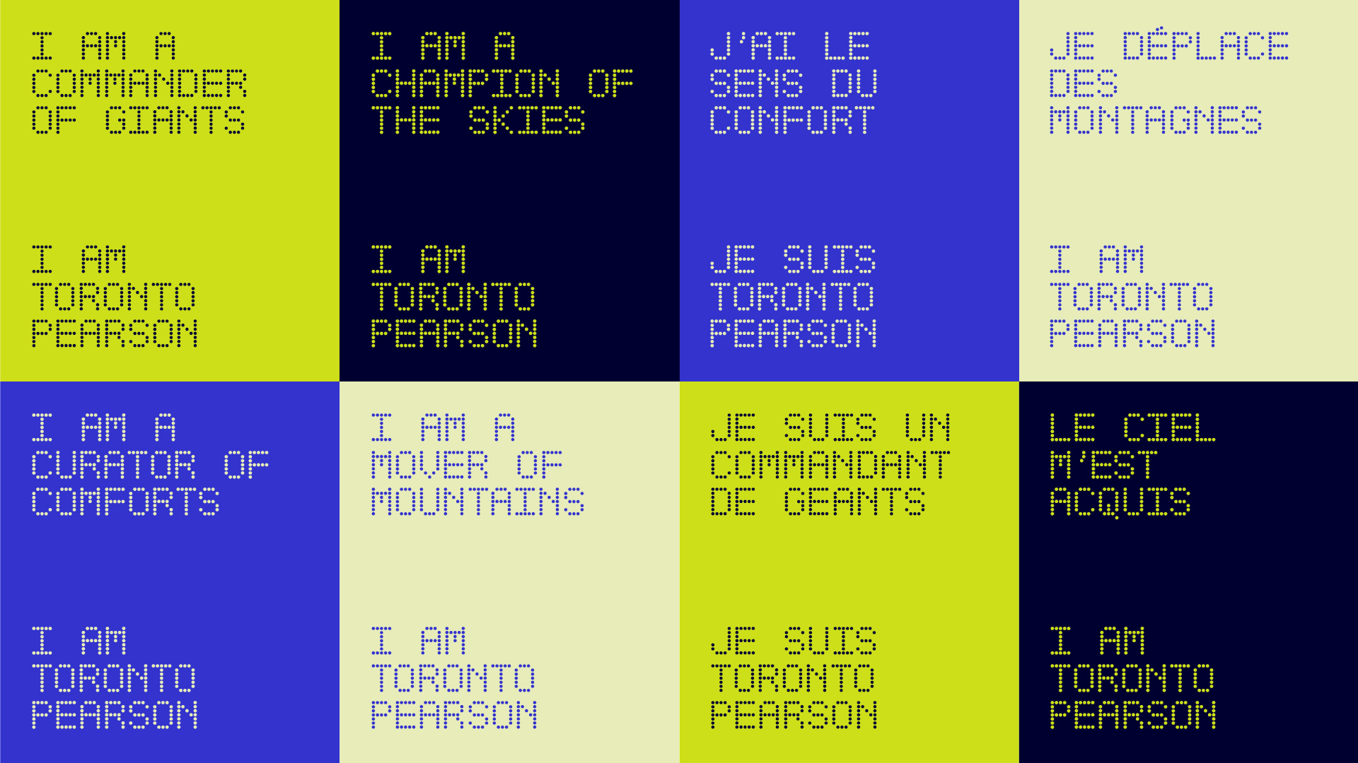
This is an article (a disguised ad?) from Abduzeedo with pictures showcasing this mockup bundle, but the actual website where you can check it out is this one, I'm mostly sharing because they look high quality for a reasonable price : https://showcasebh.com/ > The Brown Branding Mockup Series is an array of elegantly crafted mockups that showcase various objects including paper bags, boxes, envelopes, letterhead, and business cards. These items are integral to building and representing a brand's identity, and what better way to present them than with highly realistic and customizable mockups? > - Versatility: The series caters to a broad spectrum of design needs, be it branding for a start-up or rebranding for an established organization. The different objects provided allow for a complete and cohesive presentation. > - Quality: Created by Showcase Mockups, the team behind renowned design resources, the quality is impeccable. Every detail, texture, and shadow has been meticulously crafted to produce a lifelike replica of the real thing. > - Ease of Use: Even though I have two decades of experience, I appreciate tools that simplify my workflow. These mockups are easy to work with and allow for quick adjustments, making them suitable for designers at any stage of their career. 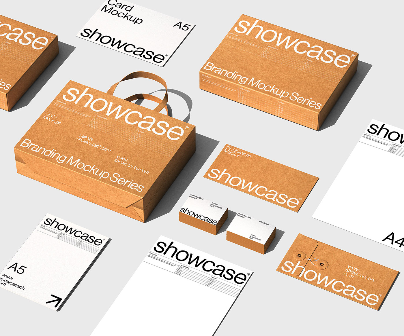
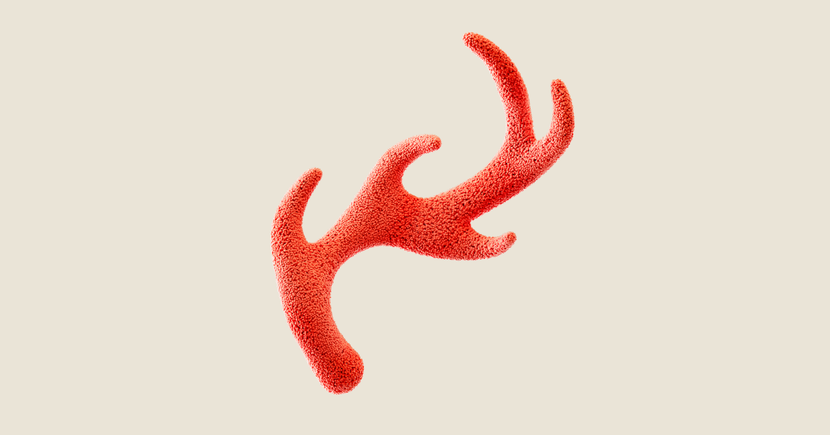 www.redantler.com
From wikipedia : >[AllTrails (www.alltrails.com)](https://www.alltrails.com/) is a fitness and travel mobile app used in outdoor recreational activities. This app is commonly used for outdoor activities such as hiking, mountain biking, climbing and snow sports. The service allows users to access a database of trail maps, which includes crowdsourced reviews and images. Depending on a user's subscription status, these resources can be used online and offline. Project page : [https://www.redantler.com/work/alltrails](https://www.redantler.com/work/alltrails) >The outside is in all of us, but the outdoorsy world of hiking boots and mountain peaks can be intimidating. As an app built and curated by the community, AllTrails helps people plan, live, and share their next outdoor adventure — whether that’s a hike up a mountain or a stroll around the neighborhood. Our brand system leverages a path framing outside stories big and small along with inclusive imagery to awaken the outside people in all of us. 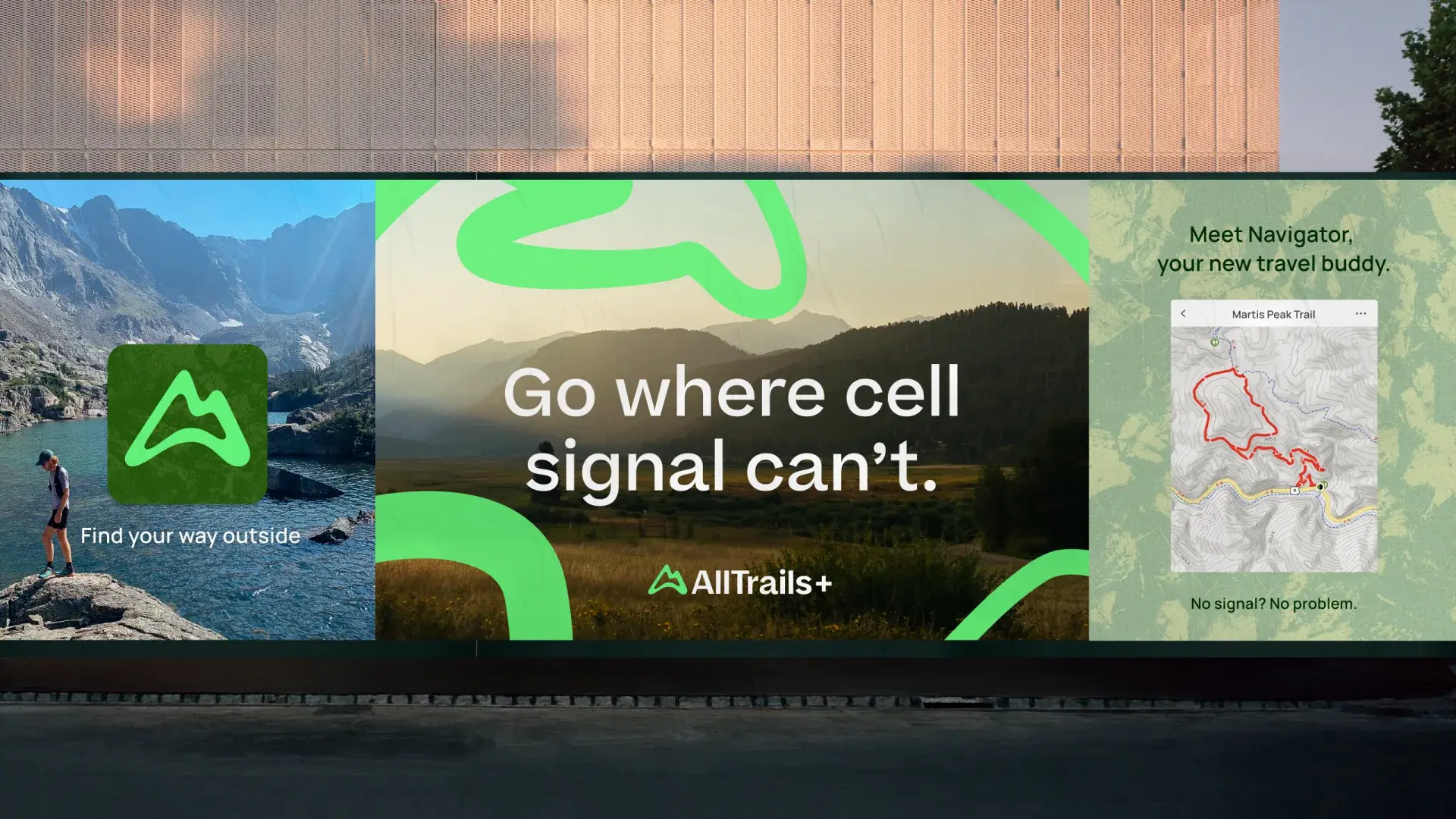
 raw.studio
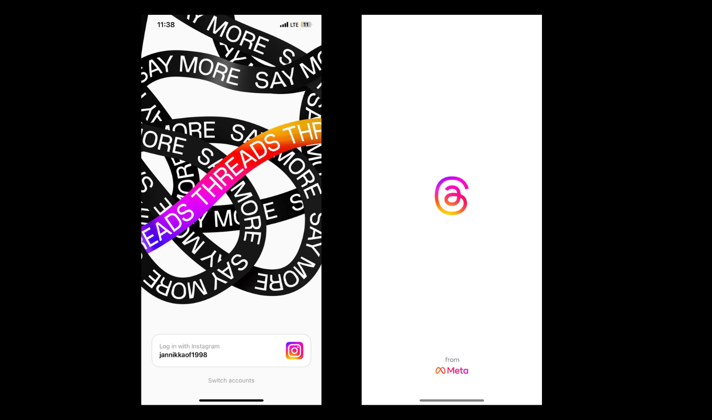
An article from Jan Nikka A. Estefani 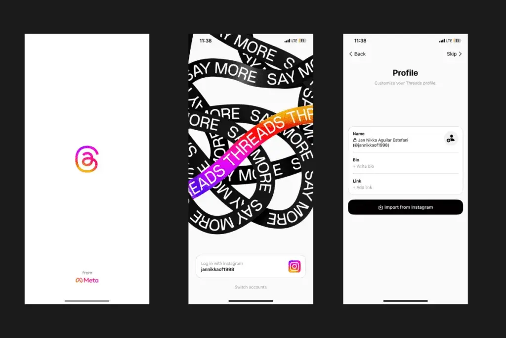 > In the vast landscape of messaging apps, Threads App has emerged as a standout platform, focusing on streamlining conversations and fostering meaningful connections. Its user-centric approach and seamless design have garnered widespread attention. Threads achieved an astonishing feat by reaching a high amount of users in just 5 days after its launch. > This unprecedented success can be attributed to its innovative features, word-of-mouth recommendations, and strategic marketing campaigns that captivated the interest of tech enthusiasts and casual users alike. The app’s ability to cater to diverse communication needs while maintaining a simple and intuitive interface contributed significantly to its rapid adoption by millions of users worldwide. > In this detailed article, we will explore the key aspects of Threads App’s UX/UI, from the onboarding process to the application of UX and UI principles, while also discussing potential issues and concluding with an overall assessment of the app. To contrast with the statements above, this article from Kyle Barr is also an interesting read : [https://gizmodo.com/threads-has-lost-more-than-80-of-daily-active-users-1850707329](https://gizmodo.com/threads-has-lost-more-than-80-of-daily-active-users-1850707329)
 www.doc.cc
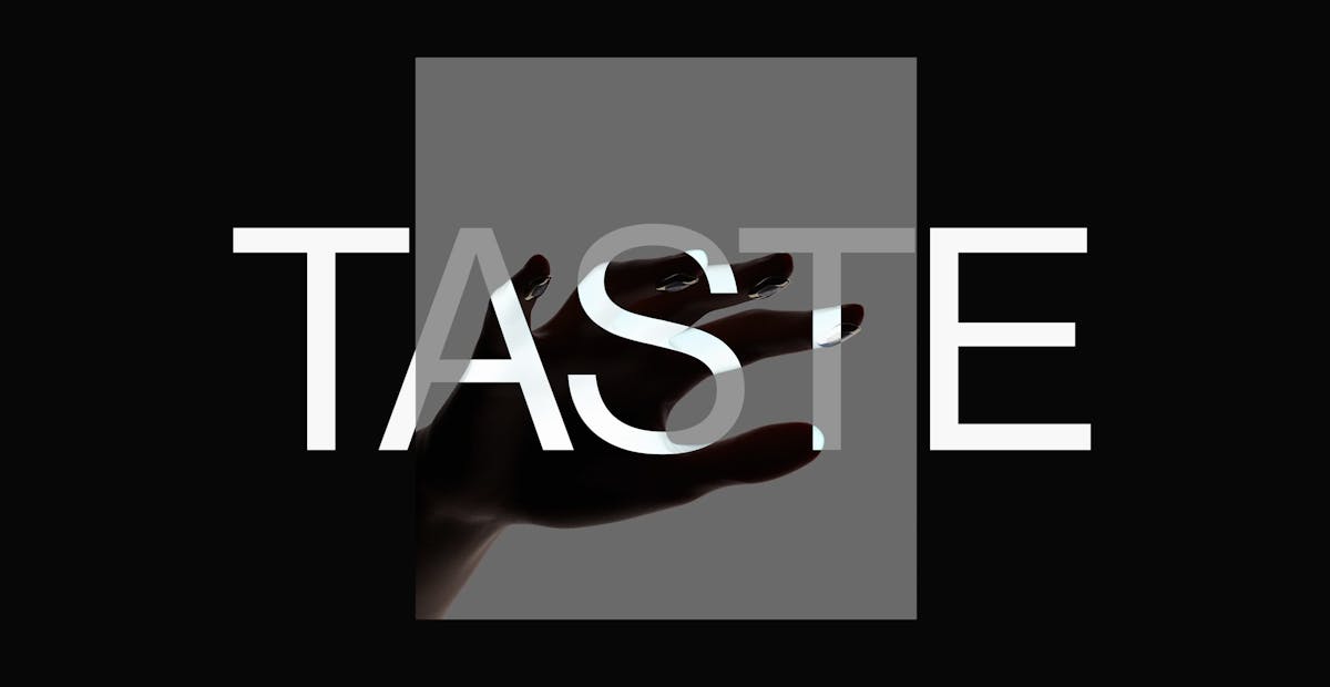
> **Taste is not purely subjective** > > People think taste is subjective, until they start to design things. Paul Graham argues that most people keep their thoughts on taste as unexamined impulses, starting from childhood. When they like something, they have no idea why—it could be because their friends like it, because it’s fashionable, or because a movie star uses it. Once they become designers, they start to realize the relationship between taste and good design. We all need to examine taste more objectively. [...] > As designers, we have to start objectively defining quality: what does quality mean for our company, our team, and our own careers as designers? How can we make design education less focused on process, and more focused on quality? When we eliminate blurry words and subjectivity from the conversation, our individual taste skills can finally be used to reach that shared quality goal. Relevant (and linked in the article) pieces : - [Taste for Makers, from Paul Graham](http://www.paulgraham.com/taste.html) - [Tomorrow, and Tomorrow, and Tomorrow, a book from Gabrielle Zevin ](https://www.goodreads.com/book/show/58784475-tomorrow-and-tomorrow-and-tomorrow) - [How A24 took over Hollywood, a video by Vox Media](https://www.youtube.com/watch?v=7tuRJIkDcXg) - [The role of taste in design, from Cennydd Bowles ](https://cennydd.com/writing/the-role-of-taste-in-design) - [You are what you eat: How to improve your product and design taste, from Herbert Lui ](https://thenextweb.com/news/eat-improve-product-design-taste) - [On Taste / Process, from Margherita Sabbioneda](https://margipippi.com/On-Taste-Process)
 www.theverge.com
This is probably only exciting for type nerds, but I'm sort of excited. I'm not a fan of Calibri, but it was at least better than Arial. Aptos actually looks great, more refined like helvetica.

A fusion of leopard and the looks of Lemmy logo. It is the part of new macOS application for browsing Lemmy, !leomard@lemm.ee. - 🧑💻 App developer: athlon - [Lemmy](https://lemm.ee/u/athlon) - [Mastodon](https://mastodon.social/@athlon) - 💾 SVG: [leomard.inkscape.svg](https://github.com/Athlon007/Leomard/blob/08b97b17acb97d9e5141be79666c156ff2a29c5d/Assets/leomard.inkscape.svg) - 🔄 [Logo announcement](https://techhub.social/@vintprox/110685704867322709) - 🔄 [Leomard announcement](https://mastodon.social/@athlon/110725420626181742) > Artist: [vintprox](https://techhub.social/vintprox) > > This work is licensed under a [Creative Commons Attribution 4.0 International License](https://creativecommons.org/licenses/by/4.0/).


I suppose, it's not too complex and the headline of [The New Oil](https://gitlab.com/thenewoil) website is delivered through this vector image in a good capacity. I really like Inkscape for all my minimalistic artwork. To understand the context, refer to [issue](https://gitlab.com/thenewoil/website/-/issues/67) and [Penpot prototype](https://design.penpot.app/#/view/11fde340-21f4-802e-8002-89983b56d77f?page-id=11fde340-21f4-802e-8002-89983b56d780§ion=interactions&index=0&share-id=88d87192-d205-8007-8002-89daa510bd8f). ## Making ### [Start](https://gitlab.com/thenewoil/website/-/issues/67#note_1404620790) The headline is "The Beginner's Guide to Data Privacy & Cybersecurity". At first, I just tried a bare oil drop representing the logo of TNO. This drop can be easily done with Path tool and mirrored through Path Effects or manually. I placed duotone gradients on both fill and stroke in such a fashion that gradients don't mix together (almost perpendicular directions). ### [Semi-Finals](https://gitlab.com/thenewoil/website/-/issues/67#note_1404711758) It was the start, but it was pretty boring. It's not memorable. You visit a landing page of TNO and you already forget what discerned it from some oil company. But TNO is not about the oil per se - it's about data and being secure in the Internet. So, it was imperative to add reference to data privacy, while being true to the title and logo. Oil drop remains there without a question (and it will play a role in the layout of section below). #### New Item How to make it without overcomplicating? The first thing that comes to mind when people mention privacy is a lock of sorts. You put your data behind a lock and open it only for certain parties. It's just a simple analogy that would pour some nice oil in the delivery. However, adding the lock alone doesn't resemble data privacy. It would just seem as if we put the oil behind that lock, silly! We're not blocking the oil, it's not the purpose of TNO. Can this be fixed? #### Binary Stream I know it will sound awfully stock-ish, but "data" that we see in images is better represented with binary streams - 1s and 0s. I could immitate some text note with dashed lines, of course, but "data" we're talking about is not limited by plain text. It could be just any metadata that people want to secure, really. This is nothing new, just yet another analogy on top of previous analogy that we've seen countless times while reading various articles. 0s and 1s are an artistic tool here and nobody's going to decypher them. Could use triangles or other shapes, but they aren't popular for showing data flow. How do I combine this with aforementioned lock? I put zeros in a 3x3 grid to fill the lock base. Now it looks like a bunch of holes, but only I remember about "1", epiphany strikes. This same "1" can serve as a key hole. Of course! There must have been a hole for opening - what's the purpose of data if you can't eventually unlock it, right? #### Masking And so, we have 8 zeros and one straight line that looks like number "1" in the center. Zeros work as a translucent mask that softens the image in their place - this way, I don't need to introduce another color into mix. Key hole works as fully transparent inverse clip - you can look at it and think of it as a literal hole. Lock itself has the gradient that, unfortunately, doesn't contrast well with the underlying oil drop. Poor design choice, isn't it? Despite that, I made a small detail that proved decisive later - gradient aligns perfectly with the gradient of drop's stroke. ### [Finish](https://gitlab.com/thenewoil/website/-/issues/67#note_1408469754) After carefuly reviewing what decisions made it look cheap and underdeveloped, I came to a conclusion that the use of gradients differentiating in direction has to go away. At the same, I needed to make the lock seem prominent. As usual, I could not afford adding another color to the mix. Even if I just used pure white or black, they would age badly with the ever changing background theme (light/dark). And that's where it clicked! Why not use the difference in transparency? Alpha channel that can be manipulated by masking - that's the new guideline I came up with for every new stroke I make. It just looks a lot richer to me. Came as far as to remove any gradients from child objects and stamp one on a top-level object. Such is the way to avoid unnecessary repetition, DRY applied to vector graphics! I aligned the stroke of same width from lock with the stroke from oil drop. A semi-transparent hole for the recess between shackle and base needed to be added, because of its small size combined with earlier strokes. Everything's in place. This whole process led me understand how progressive minimalism can make image better with all the simple simple guidelines that I didn't even need to take from someone. It's about practice and challenge that you make for yourself. In the end, image seems to fulfill the requirement for headline delivery - it helps the reader to memorize visuals and associate them with the underlying concept, what they came for. ## Download You are welcome to disassemble my work to retrace how this vector image was produced in a non-destructive fashion, meaning that all underlying paths can be extracted and shapes can be changed for more experimentation. - [Inkscape SVG](https://nch.pl/s/xgrQPsxf7CwPdpL) This work is licensed under a [Creative Commons Attribution 4.0 International License](https://creativecommons.org/licenses/by/4.0/).
 www.creativebloq.com
I try to be pretty open-minded about rebrands, because I don't know what the brief was, but this one did make me chuckle. It seems like a massive undertaking for some very subtle changes. The reasons they give are pretty funny, and they even have a brand sound and a BRAND SCENT!!!!!!!!!!!!!!
 www.chrbutler.com
For all my younger design homies, a nice refresher/introduction to gestalt theory. I will probably use some of this in my classes.
 It takes a lot of skill to make something so perfectly like a neighborhood pizza joint and also sophisticated. The humor and the illustrations are so good.
 www.itsnicethat.com
I think that it's great that they talk to real creatives and get their perspectives. I'm very introverted but I have also learned to be very good in social situations.
 theinspirationgrid.com
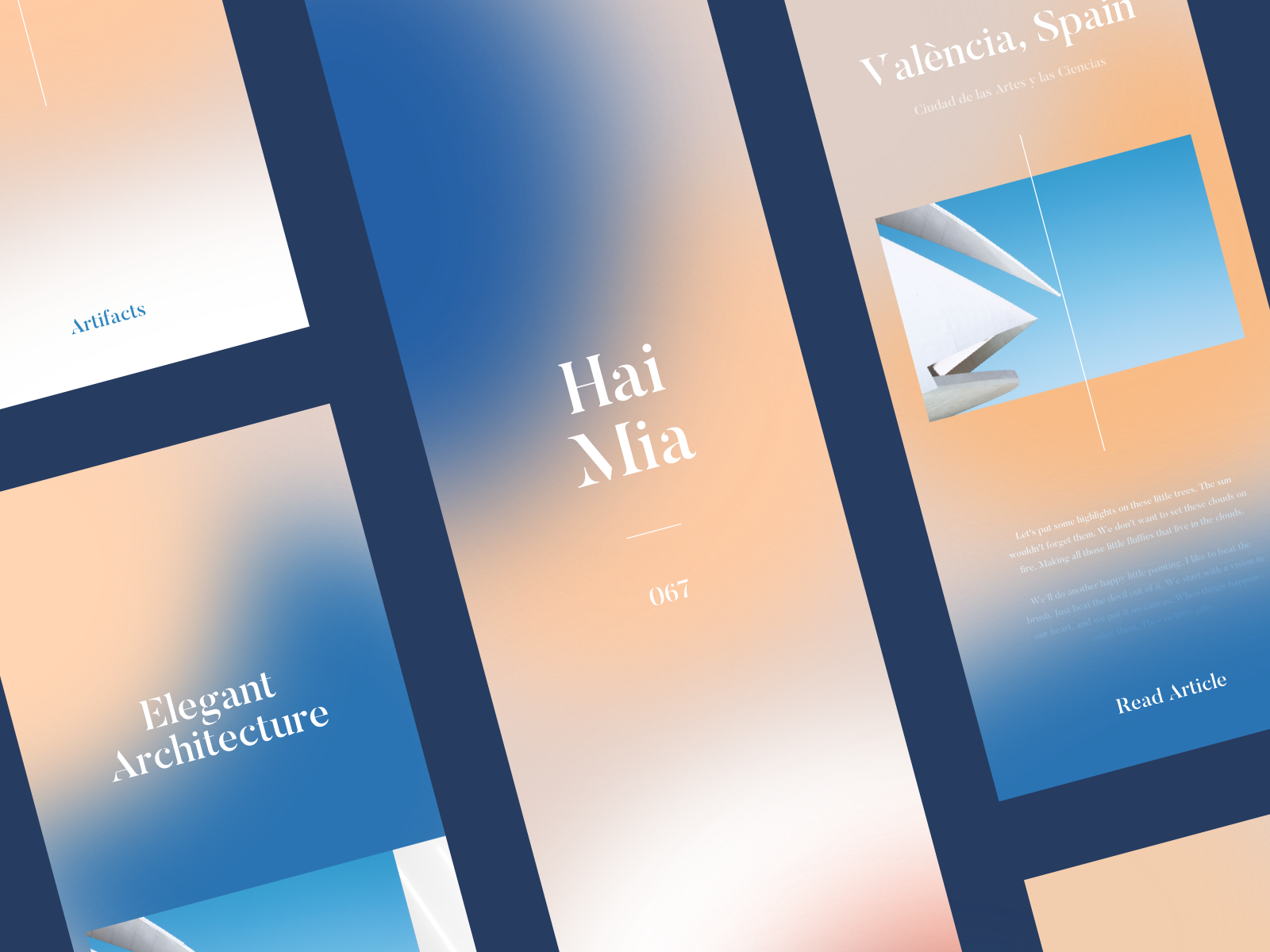
Such a simple style, but the cohesive vision and execution makes it work so well.
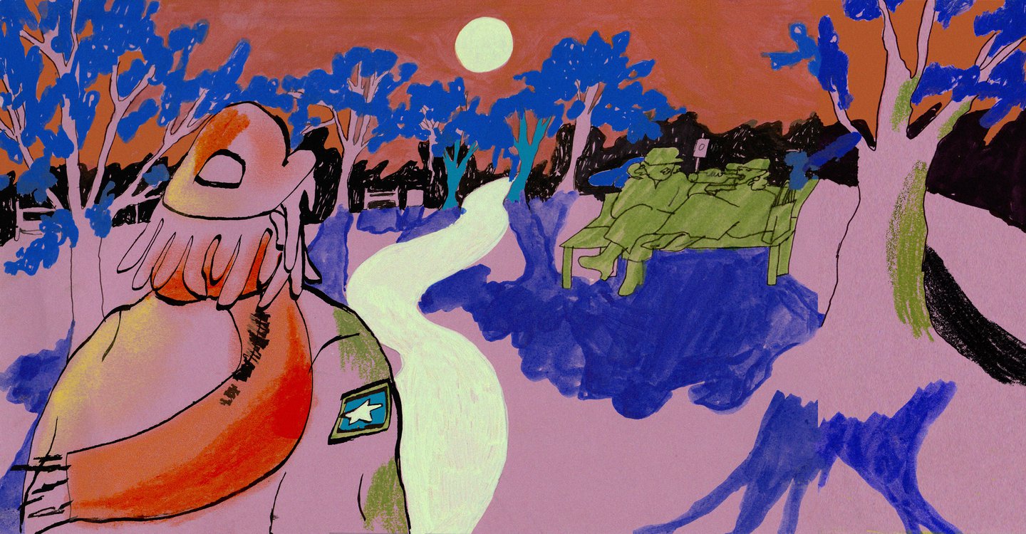
The idea is great, and the illustration style is wonderful. I love it when people use their design and passion to create unique ideas like this.
So many people try to tackle this style and get it very wrong. It feels like it aims for a "young" aesthetic, but it still is sophisticated in execution.